WEE ANNIE IPA
Packaging, Logo Design & Branding
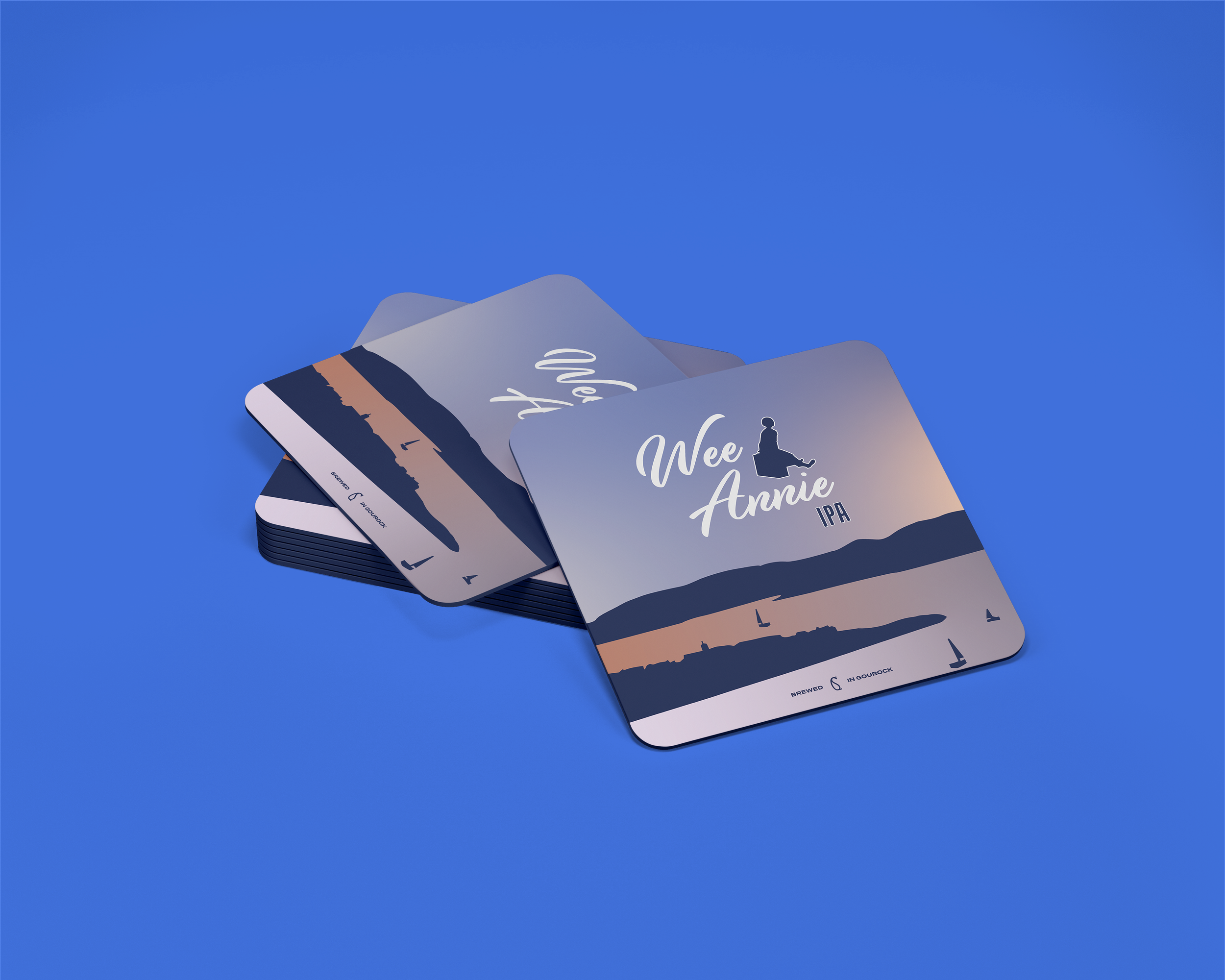
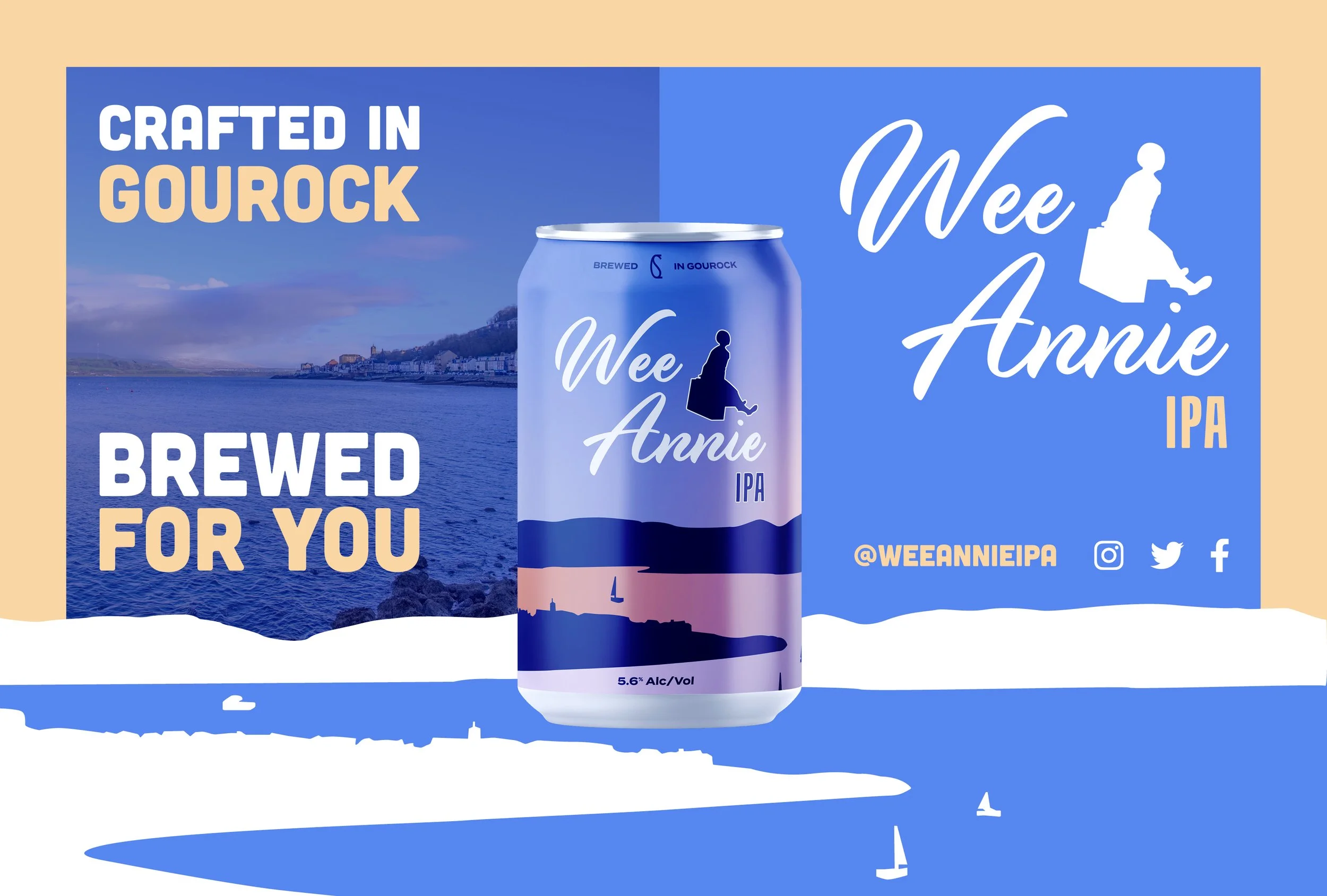
As a native of Gourock in Inverclyde, my fascination with contemporary craft beer packaging inspired me to embark on a venture of my own, crafting a brand steeped in the essence of my hometown's renowned local statue - Wee Annie.
The narrative behind the Wee Annie statue pays homage to Gourock's historical identity as a charming seaside resort. Situated by the local pier, it serves as a poignant reminder of an era when Clyde Steamers ferried passengers down the picturesque Firth of Clyde.
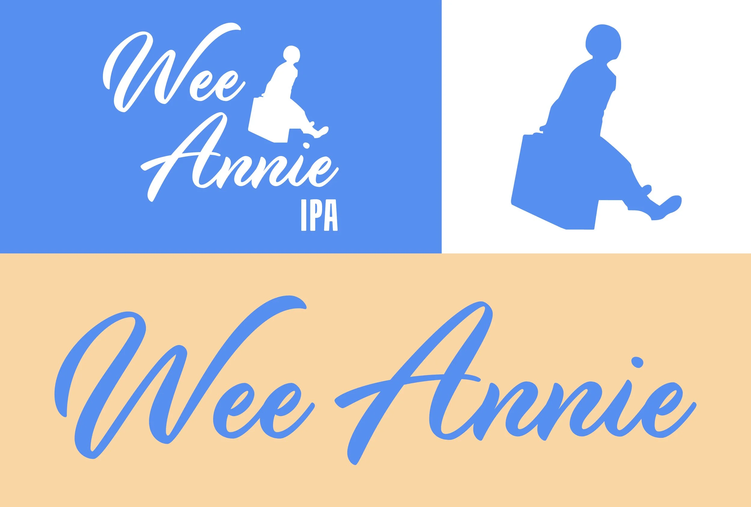
The silhouette of Annie seated atop her trusty suitcase, a cherished companion during her holiday adventures, became a central motif in my brand's logo. It evokes a sense of nostalgia, reminiscent of the excitement families experienced upon arriving in the welcoming embrace of Gourock. The town itself serves as another focal point in the visual narrative, pulsating with vibrant energy under the radiant sun and offering breathtaking vistas of sunset hues melding with the azure sky. The colour palette mirrors this natural beauty, mirroring the vivid blues of the sky blending seamlessly with the warm hues of dusk, encapsulating the allure of Gourock's scenic splendour, whether admired from afar or experienced firsthand while cruising the waters.
While my expertise lies not in the realm of craft beer and pale ales, my intimate familiarity with my hometown imbued this project with an undeniable sense of joy. Witnessing my vision come to fruition, from its inception to tangible form, has been immensely gratifying. It's a testament to Gourock's enduring charm and its rich legacy of hospitality, with Wee Annie serving as an emblematic beacon, inviting visitors to discover the joys of this friendly location.


